
Watermelon Reporting: Why RAG Status Goes Red Without Warning
- Abby Jones
- 2 days ago
- 7 min read
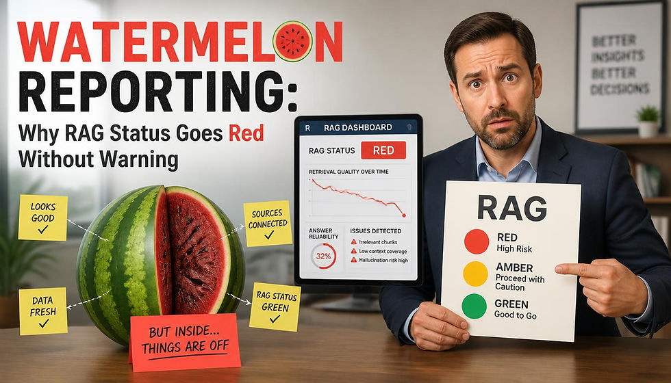
A project status report is a forecast, not a measurement. It records what one person believes about a date that has not arrived yet, formed under conditions that quietly reward optimism. Hold that distinction for a moment and a familiar pattern starts to make sense: a project reports green for seven weeks, reports red in week eight, and afterwards nobody can point to the week it actually turned.
Most of the time nobody lied. The color was carrying more weight than a color can hold, and the reporting line around it was not built to catch drift. Research across public appraisal, IT delivery, and megaproject economics has been saying so for two decades, and the answer it points toward has very little to do with asking people to be braver.
The Optimism Is Measured, Not Anecdotal
Most delivery teams know the watermelon: a project that reports green on the outside and is red the whole way through once you cut into it. What is less widely known is that the effect has been quantified. Mark Keil, H. Jeff Smith, Charalambos Iacovou, and Ronald Thompson pulled together fourteen studies for MIT Sloan Management Review in 2014. In one of them, covering 56 experienced software project managers, status reports were biased 60% of the time, and the bias was more than twice as likely to run optimistic as pessimistic.
Read that as a base rate rather than an accusation. If three project managers hand you a report this morning, the arithmetic suggests roughly two of those reports sit somewhere better than the underlying reality.
The mechanics are more interesting than the number. Misreporting rarely takes the form of a false statement, because a false statement is easy to catch later. In the government projects that team studied, $150,000 of unfinished work was moved into a newly created phase two and phase three so the original phase could be closed as complete. Elsewhere, because only bundles of work above $500,000 were classified as projects and therefore audited, teams packaged work into sets that sat just underneath that line and gave them names that were not project names. Every individual figure in those reports was defensible. The report as a whole was not.
This is why "be honest in your reporting" is such weak advice. Nobody in those examples had to think of themselves as dishonest.
Public Appraisal Priced the Optimism In Rather Than Arguing With It
Bent Flyvbjerg's database of more than 16,000 large projects, described with Dan Gardner in Harvard Business Review, found that 8.5% came in on budget and on time, and 0.5% came in on budget, on time, and with the benefits that were promised. Optimism at the estimating stage is not a local culture problem in your organization. It is the base rate everywhere.
The UK Treasury's response to that is worth borrowing whether or not you work in the public sector. Its supplementary Green Book guidance on optimism bias does not ask appraisers to be more realistic. It hands them a table and instructs them to add a documented percentage to their own numbers before anyone reads the business case. Standard civil engineering work carries an upper bound uplift of 44% on capital expenditure and 20% on works duration. Non-standard civil engineering carries 66% and 25%. Equipment and development projects, the category that covers software and systems, carry an upper bound of 200% on capital expenditure and 54% on duration.
The instruction attached to that table matters more than the figures in it: "always start with the upper bound." You reduce the uplift only in proportion to the contributory factors you have genuinely managed, and the evidence for that reduction has to be independently verified before it is allowed.
Notice what has been designed out. Nobody is asked to assess their own optimism, because people are poor at that. Nobody is asked to volunteer bad news, because the correction is applied before the bad news exists. The same logic transfers to status reporting almost directly.
The Reporting Line Shapes the Report
Ask who a report is written to before asking whether it is accurate. The MIT Sloan review found that the greater the power distance between reporter and recipient, meaning the more the recipient can affect the reporter's career, the more optimistic the reports became. That cuts against standard advice. Putting a senior executive in charge of a project buys visibility and resources, and at the same time it makes candid reporting harder, particularly when the project was that executive's idea in the first place.
Trust turned out to be the strongest single lever. In a survey of Project Management Institute members, trust in one's own supervisor had the largest effect on willingness to expose a project in trouble. The authors' own remedy is to have project managers report into a PMO as well as into the sponsor, specifically to shorten that distance, which makes PMO design and governance a question about the accuracy of your data rather than an administrative one.
The receiving end fails too. Researchers call it the deaf effect: the bad news arrives and gets discounted because of who carried it. Auditors interviewed in that body of work described executives who heard a warning and downgraded its seriousness in the same meeting. Adding more scrutiny to an environment like that tends to produce a cycle where reporters get better at managing auditors rather than better at reporting.
If amber costs a project manager more than green does, you will get green. That is not a character flaw in your team. It is the price list you published.
Write the Thresholds Before Anyone Needs Them
The repair starts by taking the judgment out of the color. "Amber if the forecast finish slips more than ten working days" is a threshold. "Amber if the project manager is concerned" is an invitation to negotiate, and it will be negotiated by whoever has the most to lose that week.
Thresholds have to be written while nobody's date is at risk, which in practice means early in planning, alongside the charter and the scope statement. Set red separately for schedule, for cost, and for benefits, because a project can sit comfortably inside its budget and still be unable to deliver what it promised. Decide who is allowed to change a threshold and on what evidence. Teams that already run formal risk and quality gates have the easier job here, because the habit of defining a trigger in advance is the same habit. The ordinary project planning documents most teams already produce, charters, scope statements, risk registers, and decision logs, will hold all of that without anyone buying new software for it.
A threshold set in week one is a rule. The identical threshold proposed in week nineteen, with a slip already on the table, is a concession, and everyone in the room reads it that way.
Rate the Commitment, Not the Effort
A team working nights and weekends to pull back a slipped date is still red. That sentence starts arguments, and it is worth having the argument once, in advance, because effort is the most common thing a green rating is actually reporting.
Percent complete deserves its own suspicion. It is the softest number on any report, it is almost always self-assessed, and it has a documented habit of parking at ninety for weeks while the remaining tenth turns out to be the hard part. Anything you can source from the work itself rather than from an opinion, which is the whole argument for earned value and other measured reporting metrics, is harder to shade. Ask what is finished and accepted rather than what is nearly done. A deliverable a named person has signed off is a fact. Ninety percent is an opinion with a number attached to it.
The useful question in a status meeting is not how much is done. It is what would have to be true for the committed date to hold, and whether anybody has checked that it is true this week.
Keep the Record That Sits Between the Reports
A status report compresses several weeks onto one page, and compression is where the drift disappears. The material that would have explained the color change is almost always in the gaps: the day a dependency moved, the call where a scope change was accepted verbally, the assumption that stopped holding and was never written down as an assumption in the first place.
That record does not need to be elaborate. A dated line for each decision, naming who asked for it, what was chosen, what was assumed, and what it moved, will carry the weight. The meeting notes from the calls where those decisions get made are usually the cheapest place to capture it, because the conversation has already happened and someone was already sitting in the room.
The payoff arrives the week a color changes. A project that goes from green to red with a written trail behind it produces a conversation about what to do next. The same change with no trail produces a conversation about whose fault it is, and those meetings have never recovered a single day of schedule.
What This Changes
None of this makes forecasting accurate. Flyvbjerg's numbers still hold, the Treasury's uplift table still holds, and your project will still be harder than it looked on the day you planned it. What changes is when you find out.
So borrow the Green Book's move and apply it to the color rather than the budget. Start from the assumption that the status in front of you leans toward good news by a known amount, and lower that assumption only where somebody can show you evidence. A portfolio with defined intake and review gates has somewhere sensible to put a red project when one finally admits to being red, which is the other half of making the admission safe.
It is a less comfortable way to run a portfolio review. It is considerably more comfortable than week eight.


